Q1. In what ways does your media product use, develop or challenge forms & conventions of real media products?
a) The Short Film


In Surprise, the narrative comes in reverse. The film starts with a guy's death, and plays back to the moment when he was still alive. In our film, we use flashbacks to only show the crossing paths of the two characters, which do not appear in chronological or linear. Majority of real films and short films are in non-chronological order, as this is more interesting for the audience to guess what's going to happen next. The films that always begins with the ending of the story is mostly thriller, as it raises questions.

Bordwell & Thompson's Theory ( Plot vs Story )
The story of 'Connected' is about a connection between a boy and his father who never met each other before. They are both keen to find out about each other and they meet time to time in different places but never notice. When they get closer to know about each other, the boy accidentally dies.
The story of 'Connected' is about a connection between a boy and his father who never met each other before. They are both keen to find out about each other and they meet time to time in different places but never notice. When they get closer to know about each other, the boy accidentally dies.
The plot mostly shows the similar activities in daily life on both father and son's sides. There is no connection of them seen till the ending scene. This parallel cut of the both sides result being cross cutting; they have met in time to time and place to place, but each time when they meet is all highlighted in the end.
2. Characterisation

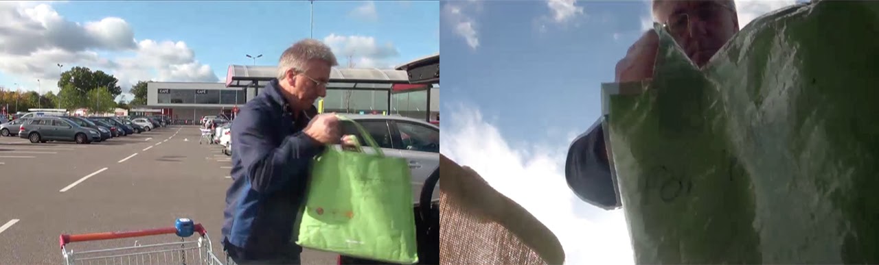
In Bitch, a guy takes tuna can in supermarket is typical male. We have a same situation in our film, when the guy does grocery shopping in the supermarket. In our film, the guy doesn't seem as frighten as in Bitch, because he has a few shopping bags in his trolley, suggesting domestic characteristic although he wears black jacket.
3. Camerawork

In Tune for Two, POV is used from the beginning of the film to gain the sympathy from the audience. By using POV in the beginning of the film, the audience will be able to understand more of the character's feeling. Through the POV we can only see the ground and the feet of the character, showing that the character isn't well and is being kidnapped(?). Enigma code is used in the scene to raise questions such as where is this? / is the character being kidnapped? / where is he/she going? / who's dragging him/her? In our film, we also used POV of the dog. There's no enigma code or action code used in our POV because it's simply the POV of the dog. We used POV shot on the dog because it's quite important for the whole story as showing son and his father's connection. In this scene the dog was the key character/prop of connecting the two main characters. POV is often used for any films as it's easier to gain sympathy from the audience.
We also applied MOA. low angle shot from the boot to show the character's silhouette and the blue sky. This was vital as the blue sky suggest happiness, calm and peace so the audience will be able to read that the character is quite happy.
4. Sound

In A Conversation Piece, the sound plays in both diegetic and non-diegetic. In our film, diegetic sound is used throughout till the ending, only the last scene we used non-diegetic soundtrack to create dramatic mood.The both diegetic and non-diegetic are the significant part of any films as it can create mood and without these the film won't be realistic though it wasn't like this in silent era.


b) The Poster


Conventions of film poster

Title - commonly larger than the rest of the text, usually stands out in relation to positioning & colour. Although our title is the same blue as the sky, we still feel that it stands out at its position and the fact that the background colour is darker so the lighter colour on the title stands out. The title also usually tells something about the film itself, for our title which tells about a connection between the two characters.

Tagline - most often used in feature film posters, usually gives dramatic effect. We decided not to include tagline as we felt that the poster suggested enough hints about the story.

Credit block - includes the names of people involved in the film making process, usually appears in in the bottom of the poster.

Image of main characters - most film posters contain an image of main characters in setting from the film. With more well-known actor/actress in films, has effect as he/she could also appeal fans to go and see the film. We chose to use images of close-up and long-shot of main characters on our poster, as we felt that it was important to convey some hints about our storyline and this was best done by showing the two sad, cheerless & broken-heart while they look down with their backs on each others.

Ratings - ratings are useful to sell a film. Ratings tend to come from newspapers and film magazines, because then audience can rely on them. We wanted to keep to these conventions and therefore have ratings from Little White Lies & British Independent Film Awards.

References to other films - these are also useful selling point of a film. If audience can see that the other films are successful, they'll be probably more persuaded to go and see the film. We didn't put it to our poster, as it was difficult to find right position.
Our poster conforms to the conventions of most of the feature film posters overall.
Our Poster
We conform this convention by applying most of the key things that are on the real posters to make sure that our poster looks realistic.
- The images of the main characters are the largest in the poster as similar as Metro Manila
- The ratings are shown with the stars, names and the quotes
- The title is the biggest font in the poster
- The setting is shown in the background
- The credit block is in the bottom of the poster with all capitals

Our draft ideas to the final idea
Each of us had different ideas for our posters at the first stage of making poster. Charlie and I had similar ideas with large faces of main characters, while Jarrad had an idea that the main characters are in distance.

We all liked all of ideas we came up with and so combined all of our ideas in one poster. From my draft, we took the idea of back to back with large faces. From Jarrad's draft, we took the ideas of long shot of the characters and the crossing paths. For Charlie's draft, we took the idea of close up of characters' faces and the idea of centering the title in the middle of the poster.
We included all these and ended up with the final poster. We decided to use dark figures instead of coloured ones for the characters in long shot, as the coloured ones look too happy and which wouldn't fit into our film style.

Overall we included title, ratings, credit block and image of main character to our poster. Only for tagline, we decided not to include because we didn't want to spoil any storyline of our film. Although we didn't add tagline to our poster, I think we managed to conform the real film poster conventions as close to the real film poster.
This is the one of the Little White Lies magazines published on December 2012. The reviews we've looked at are in page 56 (Zero Dark Thirty) & page 62 (Jack Reacher). Through the magazine, we can see that on each page, there are some objects that are related to the front cover(Django Unchained). In this issue, chains & sunglasses are shown on most of pages.
Language & Content
1. Content

We analysed what was written in each paragraph of the review, and also found that most reviews are likely to have 5-7 paragraphs. We targeted making our review to conform to this and so ours ended up with 6 paragraphs.

2. Language
We analysed and looked at the language LWL use, and found that these language was used;
- Complex Noun - Name of person, place, state, thing or quality
- Complex Sentences - Several points compressed into 1 sentence, using complex language
- Restricted Code - Specialist language which assumes knowledge by the reader
- Adverb - Provides information about the verb
- Metaphor - One thing used to suggest something about another thing
- Pun - A word with 2 meanings
- Adjective - Describes the noun
- Rhetorical Question - Poses question that does not expect an answer
Then we tried to use these language in our review. We managed to include these language in our review as shown below.

As shown above, there are frequent use of adjectives to describe the film clearly for the reader. Restricted code is also used for those reader who are in the same industry, which meaning our target audience is them as well as normal people.
Layout


The layout overall looks very identical to the real review from Little White Lies magazine. The title, director name, cast, release date and the main image are all centred, the width of the columns are all the same, the scores/ratings and the first letter of the whole review are bold and slightly bigger than the other characters. We also put 'review' to the side, so our review would be able to fit into the review section in LWL magazine.
The only thing we didn't manage to conform from the real LWL magazine convention is that the paragraph spacing. As shown above, our review has more words than the actual review and that made the whole font size really small. This caused lack of spacing between the paragraphs and we were not even able to space out any. However we left it like that because we were quite happy about the looks overall. So though the spacing and the sizing of the font was a bit distance from the real review I still think that our review challenged and conform the convention of the LWL magazine.
Q2. How effective is the combination of your main product and your ancillary tasks?
Guide to Distribution: http://vimeo.com/77969015
Turn on the 'Annotation' option when watching the video, please.

Q3. What have you learned from your audience feedback?
Audience feedback was a vital part of our portfolio as it was a way to improve and challenge our products, and ensure that we can successfully target our audience demographic. By asking people for their input, I feel that we have been able to successfully target our audience.
How we collected feedback
Facebook, Twitter, YouTube, In person, Email

We tweeted our short film to our twitter feed which sent them a link to our film and we got a few replies. The replies said "great stuff, looking forward to the next one." and "pretty good!" some of them were from film festivals in the US suggesting to submit our film to the festivals. It was very good to get a comments from strangers showing positive comments, and it shows that we've achieved a product that strangers can notice and introduce to the film festivals.


In person
Teachers/Friends
While we were finalising our film in edit suit, we got some feedback from teachers and friends. Teacher said "The birds singing in the beginning of the film is too loud." But it was good to know because then we can improve the part which is unnatural and unrealistic in our film.
At the final stage of our editing, we were considering our film to be whether with voice over or without voice over, and so we asked AS Media student in the edit suit and got feedback. The person said "I think the film is fine without the voice over as the title at the end of the film shows the viewers that there is a connection between the two." We decided to go for the version without voice over after re-watching the two versions and thought about the feedback we got from the person.
Family
As our target audience is between young adult and middle age adult, we got feedback from our families as well. They said "We've watched so many films in our life but never seen this unnatural black out transition before." They were quite critic about our film but we decided to go with the transition as we thought it's our style. However, we also learnt that we could consider more about the audience who is older than us.
YouTube
We posted our final film onto our YouTube, we got quite many viewers. Although we hardly get any comment from anybody, we got two of "dislikes" and a "like". From this, we learnt that our short film might not be attracting people, as there are two dislikes, but on the other hand, we thought that it might be quite confusing for people to understand our film as its in non-chronological order.

Q4. How did you use media technologies in the construction & research, planning & evaluation stages?
You did well Kazumi to post this by the deadline we set for January. Well done - this has been noted. Q1 - you are on the right lines with this as you are placing your film in the real media contexts. You need to establish more of the standard conventions however at the start, and for each of the areas you take, try to say something firm about what seems to be typical, using particular examples as evidence. Your answer would be better with more illustration than you have in just the 9 frames - so when you discuss detail, you can show what you mean. You can begin by saying that there is enormous variety in short film work, giving some examples from your research of this, but where you did find some common features, make more of these, and then compare yours with detail from actual shots, frames, transitions etc from your film. You're tending to describe some general features of each aspect (eg character), but these are too generalised to gain marks at A2. You need to say more about what makes characters unusual, enigmatic, or realistic, by providing detail and illustration. Have a look at last year's level 4 work via our blogs for examples of levels of detail needed. Comparisons for the poster need more illustration - why not use annotated diagrams of yours compared to a sample real poster? You need much more detail here, and you need to justify decisions you made as a group. For the review also, you have made some descriptive comparisons, but at A2 more explanation is required - identifying similarities and differences is the first stage - then you need to explain in detail why you used the same or something different. You need to show that you understand how film posters work, and how they might work for short films. You still need to sort out the sound for the film in Q2. Do this asap so that I can give some advice. Q3 Much much more is needed here. See examples on this via our blogs.
ReplyDeleteQ4 - this is probably the strongest work at this stage. You have taken each of the technologies, and evaluated your work in each context. You can now improve this by adding more detail to the section on cameras, which is rather thin in terms of techniques used. I think you could also say more about final cut than you have, and garageband. Try to add more detail and imagery. What about indesign - this seems thin too.
ReplyDelete