1. In what ways does your media product use, develop or challenge forms and conventions of real media products?
Short film:


1. Narrative organisation & the short film format
Misstep by Sam Brewster is an example of a non-linear structure. It goes into a flashback right in the beginning meaning that it is not sequential. Many short films have all sorts of narrative structures such as non linear, linear and circular. Our short film has a non-linear structure (non-chronological). This means that that the events that happen in our short film do not appear sequential. We used flashbacks in our short film at the end which means that the film “goes back in time” for a short period. There is some sort of closure at the end as we tried to make it apparent that the boy died, however others might argue that there isn't closure as we might not have made it clear enough.
 |
| Misstep flashback (non linear structure) |
 |
| Our flashback (non linear narrative) |
2. Characterisation
Short films often have one or a few main characters which have specific traits and roles specifically designed for the narrative. In the short film Exposure the characters are very stereotypical too. The woman is the defenceless protagonist and the man is the antagonist who takes advantage of the woman. This is very common in thriller and horror films.The two main characters in our film are both male. A few of the things they were doing within the film were fairly stereotypical to males. For example, the boy plays football and the older man watches football. The dad is drinking beer in the pub while the boy is on his phone/drinking a younger person’s drink (lemonade). Although these are fairly stereotypical, there were a few non stereotypical things that they were doing e.g. the older man went shopping and cooked dinner, which is usually associated with females. In addition to gender, there were a few stereotypical things that both characters did which associates with their age e.g. the older man walked the dog and the boy went to McDonald’s. We didn’t challenge stereotypes too much as this was not the message we were trying to get across.
3. Camera work
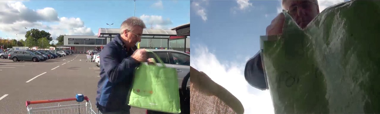
All short films must have some camera work in them for it to be a film. Most short films use a range of different shots (e.g. close ups, long shots, POV shots, low and high angle shots) used to give different effects. In the short film RVG uses different camera work like we did – in this case POV shots. They use it to make it look more realistic. We used a range of camera work within our short film. There were many generic shots that we used e.g. long shots, close ups etc. However, we did use some different camera work that is not used very often in films – POV (point of view) shots. We used this type of camera work when the boy is playing football and we got a nice effect which looked like he actually was playing football. We also did a POV shot of the dog when he runs over to the boy, however we didn’t actually put the camera on the dog, instead we ran up the hill while holding the camera low so it looked like a dog running. This also turned out to give a good effect and it made it look realistic. We also used the common match on action a few times – when the man and boy were drinking their drinks, when the man puts his shopping in the boot of the car and even in the shop when they are both looking at DVD’s.

Our camera work (▲ Match on Action shot POV shot ▼ )

4. Sound
Sound is a very important factor that needs considering while making a short film. In real life, no where is really silent, we can hear birds singing, car engines running and many other things. Films use sound to break the "dead silence" in shots. Sound can be diegetic or non-diegetic, dialogue, soundtracks and son on. In the beginning of the short film A Favour, we can hear birds tweeting in the background. This is most likely a Foley as it sounds louder than it would in real life. They put this Foley in to make the scene seem realistic just like we did and so that the scene had some sound and was not silent. Throughout the film we used a lot of Foleys to create good quality sound for the audience to hear. We used a lot of them, especially to create non diegetic ambience in many of the scenes e.g. while the boy is waiting at the level crossing you can hear cars in the background. We used a bit of non-diegetic soundtrack in the shop and pub to give it a realistic effect (as many shops and pubs usually play music.) Although a lot of the Foleys we used were from royalty free sound websites, we did record a few Foleys ourselves. When the boy is at the level crossing, the sound goes off to indicate the barriers are coming down, which was recorded while we filmed that scene. In addition, when the older man goes into the train station, we recorded the information voice over (“this train stops at destination, destination and destination”) at a different time to give the effect that he is actually in the train station.

A Favour sound (non diegetic ambience) ^

Our sound (diegetic train warning)
5. Mise en Scene
Mise en Scene is also another important/major factor in the making of short films. Many short films use Mise en Scene to help represent characters, add given effects to certain scenes and to even connect one scene to another (e.g. through a sound bridge.) In the short film Connection there is a variety of Mise en Scene to show that the man is homeless. For example, his costume is old looking clothes suggesting that he can’t buy nice/new ones. There are also props which shows that the man is also homeless which are: his sleeping bag – which shows that he has to sleep outside and a coffee cup which shows that he is in need of money which many homeless people need. Mise We used lots of Mise on Scene throughout our short film. We had to choose carefully about what Mise en Scene we would use to suit the genre of our short film. Firstly we had to consider the settings we wanted to use in our film, we chose to use eight different settings, some needing permission to film in e.g. the pub, the shop and the train station. In addition, we had to think carefully about what costumes the actors would wear. As we had many scenes, we had to make sure that they wore different clothes to show continuity throughout the film. The pace of the film had to also be considered, we made sure that it was at a normal speed as it built up to the end, where it sped up a little bit to show each time the actors crossed paths. We made sure that we used our non-diegetic sound in the right places, and made sure that the sound was the right volume to make sure it was realistic. We also had to consider the lighting in some of the shots as some of them were too dark e.g. in the library. Many other things such as: props, shot distance, positioning of the actors, colour and time had to also be considered too.
6. Use of genre conventions
We used a few genre conventions in our short film. As our short film is in the drama genre we had to pick out certain conventions that we could think of. First of all, we used a variety of realistic settings that many people would go to regularly e.g. supermarket, pub, at home etc. We felt that the purpose of our short film was to move the audience emotionally. We did this mainly at the end of the short film where we put a non-diegetic string music soundtrack. We also felt that the audience would be able to relate to our short film, as many of us do cross paths with a lot of people in our lives.
7. Editing/post production
Editing is a crucial factor that needs to be done once the filming has been finished. Editing is important as it brings the film together in the way that the director wants it. Editing includes a variety of things including: creating scenes by cutting clips into one sequence, adding effects such as blurs, focusing, colour editing and more. Also, editing can also be things such as layering videos or pictures onto clips and even green screening. In the short film Transmission, they use effects while the grandparents are looking at the tablet. They apply effects to show the video messing up a little bit because the rest of the family are on holiday and the internet connection on their end is not very good. We used final cut pro to edit our final short film. We used a variety of different things while editing to get what we wanted for our final product. Firstly, we used many Foleys in our film which had to be added after our clips were imported into final cut pro. These include: the car unlocking system at the supermarket, the train horn as the boy jumps the level crossing and even a few birds at the beginning of the film. I applied colour effects to one of our clips as we didn’t white balance the clip properly. The clip had a pink/purple tint to it so I fiddled around with the colour balance to make it look like the other clips in that scene. I also applied a little bit of a speed effect to the end clips and also increased the brightness to give the effect of the boy being “dead” and him looking over every time he crossed paths with the man. Finally, we also had a scene where the man was watching football on the TV. We had to get a video of a football match from YouTube and layered it onto the real clip of the man watching the TV. We also put a sound bridge of the commentary of the football match over the rest of this scene where the boy was playing football too.

Transmission editing (video footage on tablet)
 Our editing (video footage on a TV)
Poster:
|


 |
| Our poster |
 |
| Other film posters |

Title
The title of our poster is the biggest bit of text on the entire poster. This is a very common feature in film posters as it’s used to grab the attention of any potential viewers. Sometimes the text will have a specific colour which most likely relates to the genre of the film e.g. red text might be related to a horror or romance film. The title might have a specific font on it which can also relate to a specific genre e.g. the font might look as if it is dripping which combined with the colour red could look like blood and thus relating to a horror film. On our poster we used the same font that we used when the title appeared in short film. In addition, the colour we used was blue as it matched the sky in the poster. We also used blue as it is a fairly neutral colour and as our genre is a drama, we felt that it suited the genre. Finally, the title is usually positioned in any “dead space” around key characters. This is to make sure that none of the key characters or images are blocked out by text. We had limited space on our poster, however we felt that positioning the title on the grass was okay as it did not interfere with any of the main images.
Imaging
We used five images to create our poster, which seems a lot, however many posters for films have more than one image and is manipulated together with an editing program. In this case, we used Photoshop. The background image is a field, which I captured myself. We used this particular image as the field was the same field that we had in our short film. On this image, we also put two grey “paths” which cross in the middle. We used this to show that the two characters are connected and cross paths. The images of the faces were taken from screenshots of our film and so are the images of the two figures on the field. We put these on our poster as we found that on many posters for films, the main character(s) are very often put on them. We didn’t use any drawn imagery or animated imagery on our poster as it wouldn’t have related to the genre of our film.
 |
| Our imaging |
References
References are a very important part of a movie poster to grab a potential viewer’s eye. References to other films directed by a certain person can make people want to watch the film being shown on the poster. If a viewer has already seen a certain director’s film and enjoyed it, could be influenced to watch another film directed by that person. In addition, any references to actors/actresses on a poster that are well known can also influence a person to watch a film. This might be because they like a certain actor/actress as they are really good at what they do. We didn’t put any references on our poster as our poster was already crowded with images and other texts which meant we couldn’t find the right place to put the references.
Credit/production block
The credit/production block usually is positioned at the bottom of the poster and has to be readable. This block of writing is very important and has to be legally put on posters to show the actors/actresses used in the film and who created/produced the film. As this is a legal text that has to be put on posters, we had to include this on our poster. We used four lines of text for our credit block as this is the average number of lines of a credit block and used a white colour as it matched the other text (ratings) on the poster. In addition, we also added our “distributor’s” logo in the bottom right of the credit block and we added our own logo (as the producers) in the bottom left which is usually a common feature on the credit block.
 |
| Our credit/production block |
Ratings
It is common to find ratings on film posters as they are a useful selling point of films. By having ratings on a film poster, means that people can see what other people have thought about the film. These ratings are usually from film magazines and newspapers. On our poster we put two ratings on it, one was from Little White Lies – which is an independent British film review magazine and the other was from the British Independent Film Awards – which although is not a magazine or newspaper, rates and awards British independent films. We chose to have Little White Lies and the British Independent Film Awards as they both target independent British films which is what we have created.
It is common to find ratings on film posters as they are a useful selling point of films. By having ratings on a film poster, means that people can see what other people have thought about the film. These ratings are usually from film magazines and newspapers. On our poster we put two ratings on it, one was from Little White Lies – which is an independent British film review magazine and the other was from the British Independent Film Awards – which although is not a magazine or newspaper, rates and awards British independent films. We chose to have Little White Lies and the British Independent Film Awards as they both target independent British films which is what we have created.
 |
| Our ratings |
 |
| Our review ^ |
Little White Lies example
We chose to take the style of Little White Lies and make our own review that would fit into this review magazine. We chose Little White Lies as it is a magazine that reviews British Independent Films, which is what our film is.
Content: Before we started writing our review, we had to analyse the magazine to find out what the content, language techniques and the layout consisted of. We found out that the content of reviews which we studied consisted of: 5 to 7 paragraphs which contained a variety of information in each. As we were using the content of this review we chose to use 6 paragraphs in our review.
Paragraph 1 - contexts for the film including: literary contexts, director's previous films, historical or cultural contexts.
Paragraph 2 - information about the protagonist(s): traits, representation, key aspects and performance evaluation.
Paragraph 3 - key themes that were used, issues that may have occurred and the plot.
Paragraph 4 - narrative devices that have been used and why they have been used/what they mean.
Paragraph 5 - the use and modification of genre conventions and why they have been used.
Paragraph 6 - reviewer's experience of the film and their evaluation of it.
Language: We also had to analyse the language techniques that are used in the reviews. We felt that it was necessary to use the following language:
Complex Sentences - several clauses combined into one sentence using a variety of language.
Adverbs - the modification of the meaning of a verb.
Puns - the possibility of two or more meanings of a word.
Adjectives - a word identifying the characteristic of the noun.
Metaphors - one object/action/etc. used to describe something with another object/action/etc.
Nouns - the term of a person, place, state or quality.
Rhetorical Questions - a question that does not await an answer.
Restricted Code - a style of language that a reader is assumed to understand.
Examples of the language we used:
Complex sentences:
“He does clearly show this in the intelligent camera work and the manipulation of the story which masks the connections between Folkes and Faber, thus turning a mundane series of events into a heart wrenching story.”
“He does clearly show this in the intelligent camera work and the manipulation of the story which masks the connections between Folkes and Faber, thus turning a mundane series of events into a heart wrenching story.”
“Green’s decision to have Folkes mainly by himself and in
locations such as a pretentious pompous pub, makes numerous aspects of the film
seem abnormal and ludicrous for a young man of his age.”
Restricted code:
“…Faber is banal and lacklustre…”
“This cathartic
feeling…”
“…turning a mundane
series…”
Metaphors:
“…this is a slice of
life or vignette…”

Although we used twitter to try and get feedback, we didn't really get much. However, we did get into contact with some other short film twitter accounts and we got one reply but it wasn't very constructive. Therefore it didn't help us with improving our short film. It was positive though, which meant that at least one person enjoyed it.

2. How effective is the combination of your main product and ancillary tasks?
3. What have you learned from your audience feedback?
Audience feedback is important for producers in the creation of a film and also in the editing of the film too. By having audience feedback, producers can alter things in the film that might not make sense or that could make the film better. To get feedback, the producer will usually ask the specific audience that they are trying to attract.
To get our own audience feedback we asked through a variety of different places to see what people thought. We did this through: twitter and face to face mainly.
Although we used twitter to try and get feedback, we didn't really get much. However, we did get into contact with some other short film twitter accounts and we got one reply but it wasn't very constructive. Therefore it didn't help us with improving our short film. It was positive though, which meant that at least one person enjoyed it.
In addition, we got some feedback from face to face conversations with friends and peers of our age group. While in the editing suite, I asked a peer what they thought about the comparison of the two versions we had (with dialogue and without dialogue). She said to me: "I think the film is fine without the voice over as the title at the end of the film shows the viewers that there is a connection between the two."
I also asked my 19 year old male friend if he understood what was going on in the film and what improvements we could have made. This was his response: "I think that the film is designed to keep the audience guessing that the two characters are related, however the film doesn't actually mention the relation between the two. I also thought that they were going to finally meet until the train event. To improve, you could have got some more clips when the man/dad? is at the train station. I felt that it was a little dead at this point even though there was sound, the clips would have helped out this part."